


Project: Backyard Reno
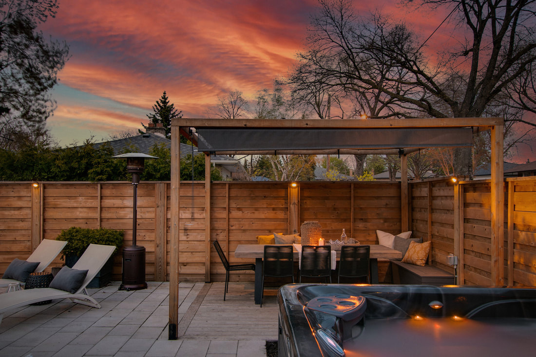
A complete overhaul of the existing pool and landscape was needed to create a boutique hotel-inspired, maintenance-free backyard. The double-faced fence boards were overlapped for max privacy. The space was designed to create zones around the pool: dining, firepit, lounge and hot tub. Large format pavers set in a classic brick pattern are modern and make the space look and feel expansive. To prevent it from feeling monolithic, I incorporated at-grade planting with low maintenance evergreens and grasses and added a cedar floor deck in the dining pavilion.


Before & during:


Project: Loft Office
This beautiful brick and beam loft in downtown Toronto had been damaged by a flood, and had no heat, electrical or flooring when I came on board in 2017. Five months later, staff were enjoying a post-work cocktail at the bar, which is one of three lounge spaces designed for the 3,000 SF space.
Residential details, like a hardwearing wool rug, pillows and decorative accents give the office a relaxed lounge-y feeling that is the opposite of "corporate cubicle."
A 7' tall walnut shelf unit solved the problem of dividing the desking area from the lounge without constructing a wall.


Post-Covid, I was brought back in to refresh the space . We reinvented the lounge spaces with new soft seating, added pattern and texture with new rugs, live plants and trees and commissioned new artwork for the boardroom.
BEFORE :


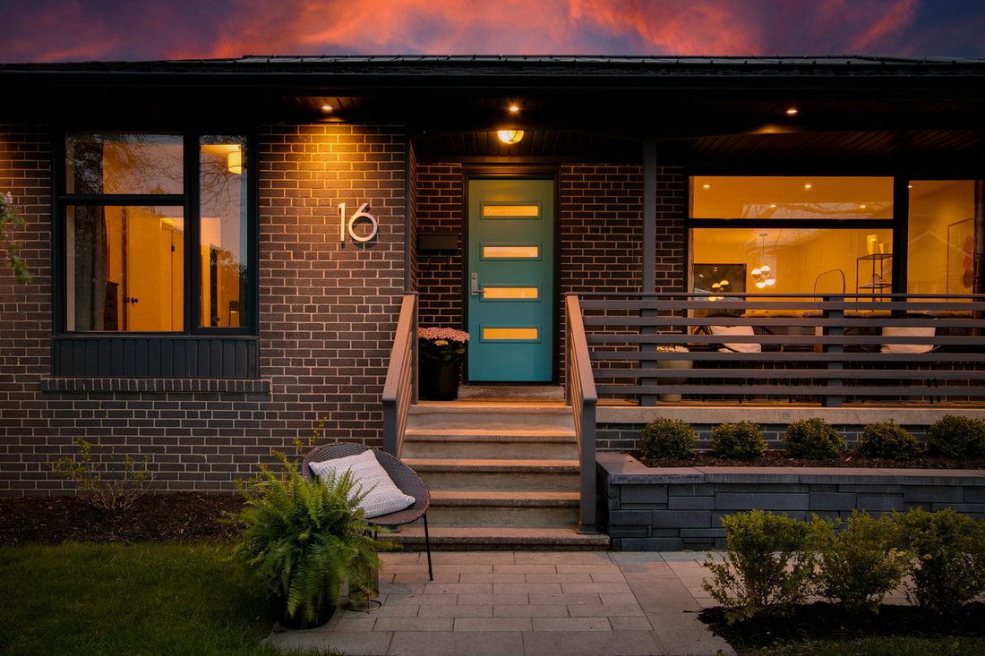
Project: Curb Appeal
A new walkway, porch railing and raised planter bed with low maintenance, symmetrical planting modernized this 1960s bungalow and added needed curb appeal.

Before:
The front door lacked a connection to the sidewalk; visitors had to navigate a narrow path beside the driveway to get to the entrance. The railing style, aluminum shutters and trim colour were dated.
The front door lacked a connection to the sidewalk; visitors had to navigate a narrow path beside the driveway to get to the entrance. The railing style, aluminum shutters and trim colour were dated.

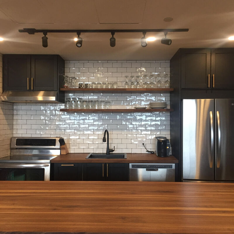
Project: Kitchen Remodel
This compact kitchen was carefully considered to maximize function and storage. Rethinking the layout and location of the appliances and creating a smaller window opening to allow for extra upper cabinets were game changers. Maintaining a 4' distance between the island and wall counters make it easy for two people to cook and clean together. This project was completed in 2012 and still looks good 11 years later, thanks to quality materials and a great layout.


Before: Choosing the make the window smaller in favour of more cabinetry was an easy decision: it was a north-facing window with a direct view into the neighbour's home, and the large dining room window lets in ample light and air flow.

Project: Entry Makeover
Before /After;
Big changes don't always have to be structural. Nothing "major" changed here and yet the result is transformative. A new door with reeded glass lets in more light, cool floor tile add pattern and interest and the bifold doors were swapped out for solid doors.
Big changes don't always have to be structural. Nothing "major" changed here and yet the result is transformative. A new door with reeded glass lets in more light, cool floor tile add pattern and interest and the bifold doors were swapped out for solid doors.


Editorial Styling


Project: Condo Kitchen
Working with existing appliances and their locations (except for the microwave, which was tucked away in the island) resulted in a good-looking kitchen with a much improved workflow. Open shelving makes the space seem more spacious; extra closed storage was gained in the island and adding full-depth cabinets over the refrigerator. The custom solid wood walnut island top is an impressive 10-feet long. It was carefully maneuvered into the freight elevator using every millimeter of space available, so we could have a single slab with no joins. More lighting was added; the glossy tile was chosen to reflect light and enhance the feeling of brightness. Brass pulls paired with matte black cabinetry are timeless.


BEFORE: the large island lacked utility and felt monolithic. The upper cabinets were too close to the countertop, making the kitchen feel small and claustrophobic.

